Cilla Ramnek
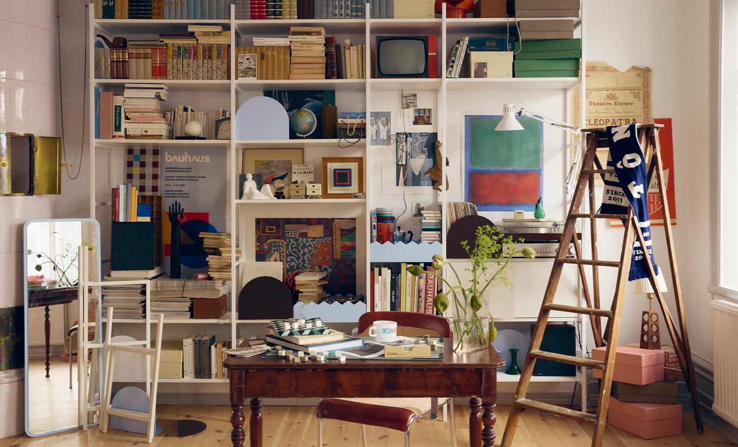
For Cilla Ramnek, life and work have always been woven together. This is also reflected in her home, which she shares with her two cats Elsa and Leo. Everything we see when we visit her one-bedroom apartment in Södermalm in Stockholm is the result of a long period of downsizing. In 2013, Cilla, who also has a background at Ikea and Svenskt Tenn, made the exhibition Home sweet home at art centre Liljevalchs in the Swedish capital together with Karin Södergren and Annica Kvint. Twelve decorated rooms that captured modern design history and inspired visitors to DIY.


What did that exhibition mean to you?
– For a whole year I was able to make all my fantasies come true. When the show was over, I had enough! Antique or secondhand stores made me physically nauseous. It is what happens when you take a passion to the very end. Like overeating.
– In an extended process, it coincided with my youngest son starting to free himself and moving out (Cilla has three sons, two daughters-in-law and three grandchildren). It was the end of a long time of parenthood and of a home that has always been there for and open to everyone. I lived in a five-room apartment with a loft of 70 square meters and wanted to remove things and close myself off a bit. Reflect on how I want to live my life when I don’t have to take care of others. My very systematic youngest son set up an office and helped me sell almost everything, and he got half the money. It became a full-time job for three months and paid for both my move and a trip to London for him.
What is left for you to have in your shelf?
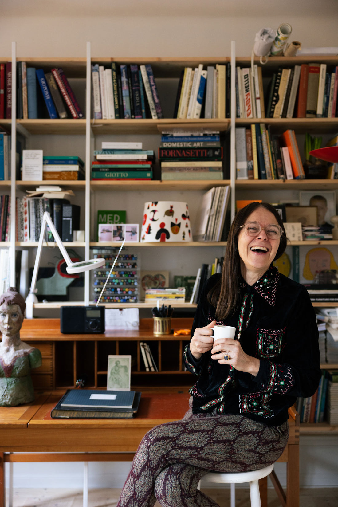
– Since I’m a sucker for aesthetics, I’ve had a hard time letting reality – the things I really need, important papers, perforators – take up visible space. But this shelf is so strong and slender in its expression, so I’m happy to mix everything in it. I have never enjoyed myself so much, or worked so well, as at this table, with everything within reach. I also have a studio, where I am more physical. I don’t do big messy experiments here, I’m much more cerebral. At the desk, I do everything that concerns the business part of my practice, that part of me ceases to exist when I move away from it.
– I have a very adventurous interior, so I need control. I think that a bookshelf like this is very much about balancing order and chaos. Where you find that point is very personal.
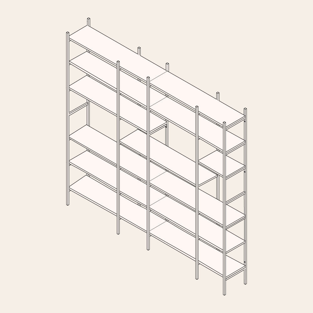
– It’s liberating that I don’t have to decide the height between the shelves. It becomes a pattern that I must relate to and creates an even rhythm in the mess. The fact that the frame of the shelf lies outside the shelves is very forgiving in terms of messiness. The frame balances the chaos. That’s great for me who have a hard time getting things straight. I don’t use a computer and nothing I create is ever straight. The shelf sturdies that.


Why this specific shelf?
– I’ve dreamed about it for a long time, almost since it came out. I didn’t really understand why until it was up on the wall; it’s the white frame. A white vertical, unbroken line means that what is inside doesn’t take over. My bookshelf is full, but it feels light. In general, I avoid putting anything on the top shelf. I think it was Josef Frank who said that if you see the meeting point between wall and ceiling and wall and floor, the impression is light. So I try not to put things on the floor to keep that floating, airy feeling.
– I find it very difficult to enforce an environment where life is one thing and style another. It becomes rigid and unreal. I come from a bourgeois background. It was all very beautiful. Beautiful art and beautiful furniture in a beautiful house. Everything was in the same place year after year. Beautiful still lives, but always in the same place.
So what’s the key behind creating a ”living” shelf?
– When I look at people’s bookshelves, I marvel at how static they are. I think shelves are something to entertain and review over time. Mine is a bit like a bulletin board. Since the frame is made of metal, sometimes I use magnets to put up images. I don’t usually have my own art at display, but the red and white circles break off the structure nicely and you can feel that they’re handmade. I enjoy that contrast, plus I still have an active relationship with them. When that dies out, I’ll put something else there. And I like the magnifying lamp, it’s also made of white metal, so it’s almost as if a part of the shelf reaches out into the room.
– I have a lot of books about architecture, designers and artists. I’m not a big reader, but I’ve stopped being ashamed of how I use books. I’ll take one out and read one page, or three because the covers remind me of a strain of thoughts that I don’t want to forget. And that’s fine.
– You know what, I love my bookshelf! It feels so nice to be able to say that without the slightest amount of lie or exaggeration.


